Stand Out with 𝑪𝒖𝒔𝒕𝒐𝒎 𝑭𝒐𝒏𝒕𝒔 on LinkedIn 🖋️
Customize Your LinkedIn Profile Font: A Creative Hack

Did you know you can customize the font in your LinkedIn profile? While LinkedIn doesn't officially support font changes, there's a simple workaround that can help you make your profile visually unique and memorable.
Using Unicode text converters, you can generate text in different fonts and seamlessly paste it into your LinkedIn profile. Let's explore how this works and why it could be a great addition to your professional presence.
How It Works: These aren't actually different fonts - they're special Unicode characters that look like stylized letters. Since Unicode is a universal text standard, these characters display consistently across all devices and platforms, including LinkedIn.
From the Creator: Building Frame Generator taught me that small visual tweaks can have outsized impact on profile visibility. Custom fonts are one tool in the visual differentiation toolkit - when used thoughtfully alongside elements like profile frames, they help you stand out in crowded LinkedIn feeds.
How to Add Custom Fonts to Your LinkedIn Profile
- Use a Unicode Text Converter: Visit a Unicode text generator online (a quick web search will find several free tools). Simply type the text you want to customize (e.g., your headline or summary), pick a font style you like, and copy the converted text.
- Paste It into Your LinkedIn Profile: Go to your LinkedIn profile and paste the custom font text where you want it-your headline, summary, or even job titles.
Why Use Custom Fonts?
Custom fonts can help your profile stand out in a sea of professionals. Here's why you might want to give them a try:
1. Visual Differentiation
In a platform where millions of professionals use the exact same formatting, custom fonts create instant visual distinction. When a recruiter scrolls through dozens of similar profiles, a thoughtfully styled headline catches attention and signals someone who pays attention to details.
2. Personal Branding Consistency
Fonts communicate personality and professionalism. A bold serif conveys authority and tradition. A clean monospace suggests technical precision. A flowing script implies creativity. Choosing a font that aligns with your industry and personal brand reinforces your professional identity.
3. Highlighting Key Information
Strategic use of custom fonts can draw attention to your most important credentials. Using a distinctive font for your job title or key skills makes that information stand out, helping recruiters quickly identify what makes you qualified.
Industry-Specific Font Recommendations
Different industries have different expectations. Here's a guide to choosing fonts that align with your professional context:
Monospace fonts signal technical expertise and coding familiarity. They're particularly effective for developers, engineers, and data scientists. Example: 𝚂𝚘𝚏𝚝𝚠𝚊𝚛𝚎 𝙴𝚗𝚐𝚒𝚗𝚎𝚎𝚛
Cursive or bold fonts showcase creativity while remaining professional. They work well for designers, marketers, and content creators. Example: 𝒞𝓇𝑒𝒶𝓉𝒾𝓋𝑒 𝒟𝒾𝓇𝑒𝒸𝓉𝑜𝓇
Bold serif fonts convey authority and trustworthiness. They're appropriate for executives, consultants, and finance professionals. Example: 𝐅𝐢𝐧𝐚𝐧𝐜𝐢𝐚𝐥 𝐀𝐧𝐚𝐥𝐲𝐬𝐭
Double-struck or small caps fonts suggest intellectual rigor and academic credibility. Example: ℝ𝕖𝕤𝕖𝕒𝕣𝕔𝕙 𝕊𝕔𝕚𝕖𝕟𝕥𝕚𝕤𝕥
Important Accessibility Considerations
While custom fonts can enhance visual appeal, they come with important accessibility trade-offs you should understand:
Accessibility Warning: Unicode-styled text is not read correctly by screen readers. For users with visual impairments who rely on assistive technology, your styled text may appear as random characters or be skipped entirely. Consider this carefully before using custom fonts extensively.
Screen readers interpret Unicode mathematical symbols literally. "𝐇𝐞𝐥𝐥𝐨" might be read as "mathematical bold capital H, mathematical bold capital E..." making your profile unintelligible to users with visual impairments.
LinkedIn's search may not index Unicode-styled text properly. If your job title uses custom fonts, you might not appear in recruiter searches. Keep important keywords in standard text.
Use custom fonts sparingly for decorative elements, not critical information. Style your name or a tagline, but keep your job title, skills, and achievements in standard text for maximum accessibility and searchability.
Best Practices for Professional Use
To get the benefits of custom fonts while avoiding pitfalls, follow these guidelines:
- Keep Critical Content Standard: Your job title, company name, and key skills should remain in standard text for search visibility and accessibility.
- Limit to Headlines: Custom fonts work best in your headline or name area. Avoid using them in your About section or experience descriptions where readability matters most.
- Test Across Devices: Check how your profile appears on desktop, mobile, and tablets. Some Unicode characters render differently across operating systems.
- Choose Readable Styles: Bold and serif styles are more readable than Fraktur or heavily decorated options. When in doubt, prioritize legibility.
- Consider Your Industry: Conservative industries like law, finance, and healthcare may view custom fonts as unprofessional. Match your styling to industry expectations.
- Don't Mix Multiple Styles: Stick to one custom font style. Mixing multiple styles looks chaotic and undermines professionalism.
Want to Try It?
Before: "Creative Marketing Specialist | Storytelling Enthusiast | Branding Expert"
After: "𝐂𝐫𝐞𝐚𝐭𝐢𝐯𝐞 𝐌𝐚𝐫𝐤𝐞𝐭𝐢𝐧𝐠 𝐒𝐩𝐞𝐜𝐢𝐚𝐥𝐢𝐬𝐭 | 𝑺𝒕𝒐𝒓𝒚𝒕𝒆𝒍𝒍𝒊𝒏𝒈 𝑬𝒏𝒕𝒉𝒖𝒔𝒊𝒂𝒔𝒕 | 𝐁𝐫𝐚𝐧𝐝𝐢𝐧𝐠 𝐄𝐱𝐩𝐞𝐫𝐭"
This subtle change can make your profile more visually striking and aligned with your personal brand.
Where can I do it?
See the bottom of this page!
Final Thoughts
Custom fonts are a creative way to make your LinkedIn profile stand out while staying professional. Just remember to use them sparingly and ensure readability. Take a few minutes to experiment with different styles, and you might be surprised at how much impact a small tweak can have!
Complete Your Profile Makeover: Combine custom fonts with a custom profile picture frame to create a truly distinctive LinkedIn presence that catches recruiters' attention.
Try It Yourself!
Enter your text below to see how it would look in different custom fonts. Copy your favorite style and use it on your LinkedIn profile!
Bold Serif
𝐓𝐡𝐞 𝐪𝐮𝐢𝐜𝐤 𝐛𝐫𝐨𝐰𝐧 𝐟𝐨𝐱 𝐣𝐮𝐦𝐩𝐬 𝐨𝐯𝐞𝐫 𝐭𝐡𝐞 𝐥𝐚𝐳𝐲 𝐝𝐨𝐠
Cursive Bold
𝓣𝓱𝓮 𝓺𝓾𝓲𝓬𝓴 𝓫𝓻𝓸𝔀𝓷 𝓯𝓸𝔁 𝓳𝓾𝓶𝓹𝓼 𝓸𝓿𝓮𝓻 𝓽𝓱𝓮 𝓵𝓪𝔃𝔂 𝓭𝓸𝓰
Double-Struck
𝕋𝕙𝕖 𝕢𝕦𝕚𝕔𝕜 𝕓𝕣𝕠𝕨𝕟 𝕗𝕠𝕩 𝕛𝕦𝕞𝕡𝕤 𝕠𝕧𝕖𝕣 𝕥𝕙𝕖 𝕝𝕒𝕫𝕪 𝕕𝕠𝕘
Monospace
𝚃𝚑𝚎 𝚚𝚞𝚒𝚌𝚔 𝚋𝚛𝚘𝚠𝚗 𝚏𝚘𝚡 𝚓𝚞𝚖𝚙𝚜 𝚘𝚟𝚎𝚛 𝚝𝚑𝚎 𝚕𝚊𝚣𝚢 𝚍𝚘𝚐
Fraktur
𝕿𝖍𝖊 𝖖𝖚𝖎𝖈𝖐 𝖇𝖗𝖔𝖜𝖓 𝖋𝖔𝖝 𝖏𝖚𝖒𝖕𝖘 𝖔𝖛𝖊𝖗 𝖙𝖍𝖊 𝖑𝖆𝖟𝖞 𝖉𝖔𝖌
Double-Struck Bold
𝕋𝕙𝕖 𝕢𝕦𝕚𝕔𝕜 𝕓𝕣𝕠𝕨𝕟 𝕗𝕠𝕩 𝕛𝕦𝕞𝕡𝕤 𝕠𝕧𝕖𝕣 𝕥𝕙𝕖 𝕝𝕒𝕫𝕪 𝕕𝕠𝕘
Small Caps
T𝖧𝖤 𝖰𝖴𝖨𝖢𝖪 𝖡𝖱𝖮𝖶𝖭 𝖥𝖮𝖷 𝖩𝖴𝖬𝖯𝖲 𝖮𝖵𝖤𝖱 𝖳𝖧𝖤 𝖫𝖠𝖹𝖸 𝖣𝖮𝖦
Circled
Ⓣⓗⓔ ⓠⓤⓘⓒⓚ ⓑⓡⓞⓦⓝ ⓕⓞⓧ ⓙⓤⓜⓟⓢ ⓞⓥⓔⓡ ⓣⓗⓔ ⓛⓐⓩⓨ ⓓⓞⓖ
Negative Circled
🅣🅗🅔 🅠🅤🅘🅒🅚 🅑🅡🅞🅦🅝 🅕🅞🅧 🅙🅤🅜🅟🅢 🅞🅥🅔🅡 🅣🅗🅔 🅛🅐🅩🅨 🅓🅞🅖
Squared
🅃🄷🄴 🅀🅄🄸🄲🄺 🄱🅁🄾🅆🄽 🄵🄾🅇 🄹🅄🄼🄿🅂 🄾🅅🄴🅁 🅃🄷🄴 🄻🄰🅉🅈 🄳🄾🄶
Negative Squared
🆃🅷🅴 🆀🆄🅸🅲🅺 🅱🆁🅾🆆🅽 🅵🅾🆇 🅹🆄🅼🅿🆂 🅾🆅🅴🆁 🆃🅷🅴 🅻🅰🆉🆈 🅳🅾🅶
Latest Articles

Frame Your Face with a Custom Banner 🖼️

Spice Up Your LinkedIn Profile with Emojis 💥

LinkedIn Profile Photo Best Practices for 2026

Personal Branding on LinkedIn: A Complete Guide

How to Choose the Right Colors for Your Profile Frame

Profile Picture Dimensions Guide for All Social Platforms
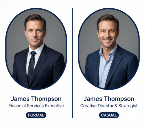
Professional vs. Casual Profile Pictures: Which is Right for You?
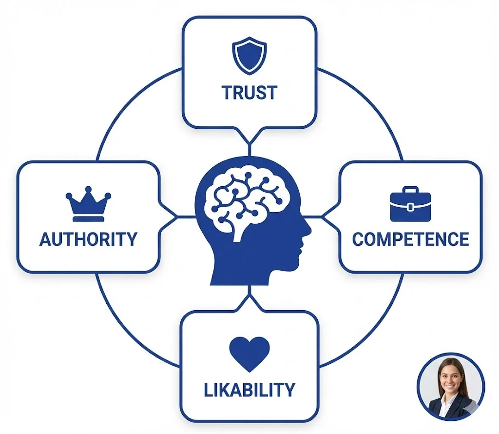
The Psychology of Profile Pictures in Professional Networking
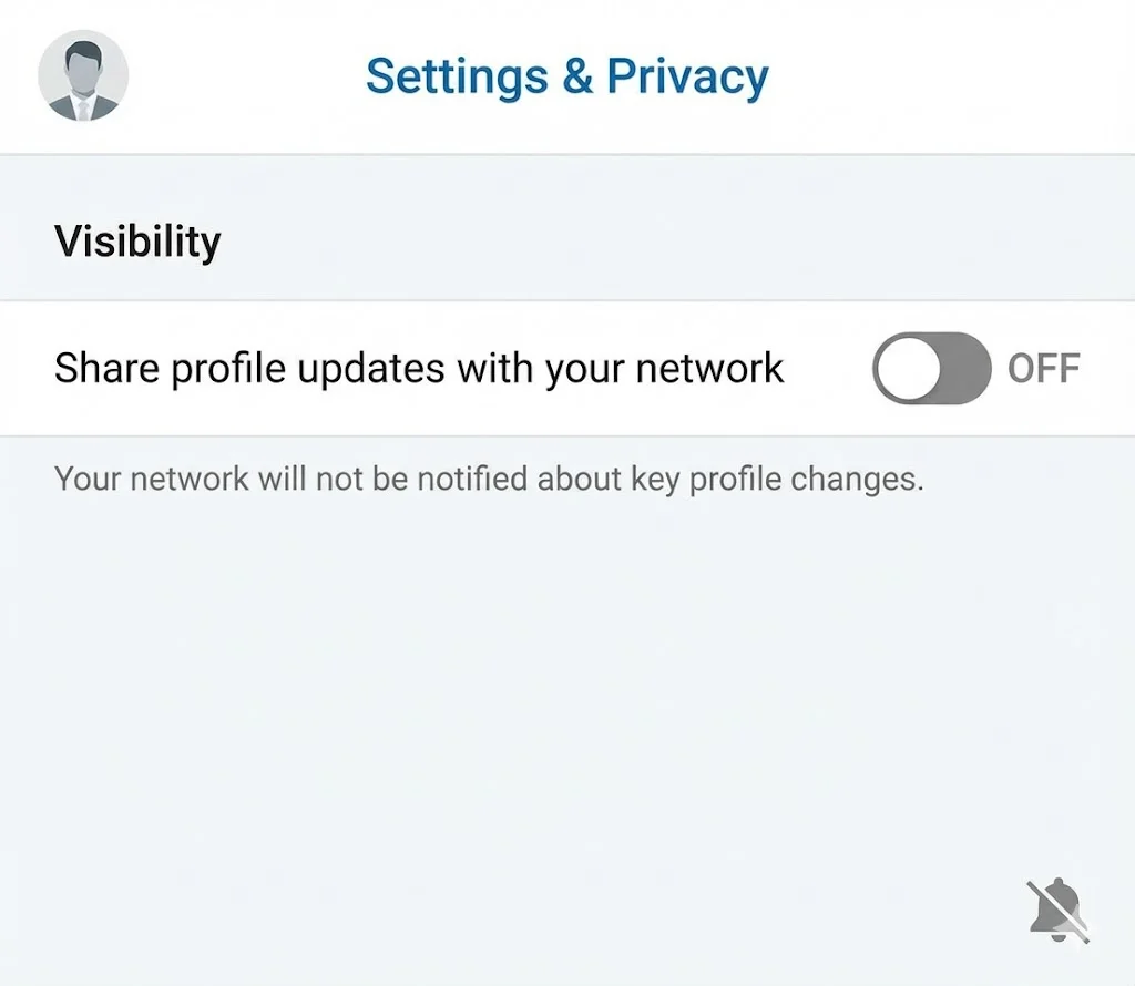
How to Update Your LinkedIn Profile Picture Without Notifying Everyone

Step-by-Step Tutorial: Creating Your First Custom LinkedIn Frame
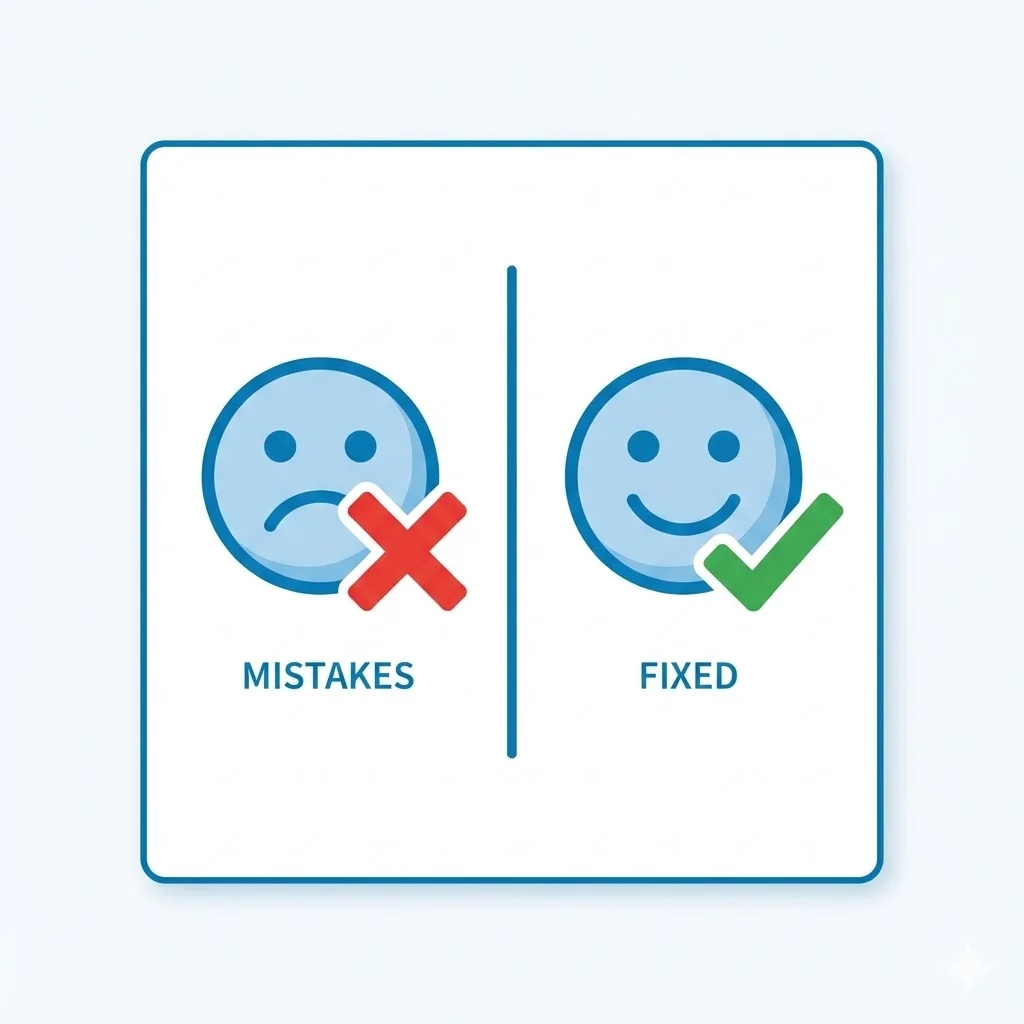
15 Common LinkedIn Profile Mistakes (And How to Fix Them)