How to Choose the Right Colors for Your Profile Frame
The Psychology and Strategy Behind Profile Picture Frame Colors
Color isn't just decoration-it's communication. The colors you choose for your profile picture frame send immediate, subconscious messages about your personality, professionalism, and brand. Whether you realize it or not, the colors surrounding your face influence how people perceive you before they even read your headline or experience section.
Choosing the right colors for your profile frame requires understanding color psychology, considering your industry norms, ensuring accessibility, and aligning with your personal or company brand. This guide will help you make strategic color choices that enhance rather than undermine your professional image.
From the Creator: When building Frame Generator, color selection was one of the most requested features. After analyzing which color combinations perform best across thousands of profiles, I've compiled these guidelines to help you make informed decisions that align with your professional goals.
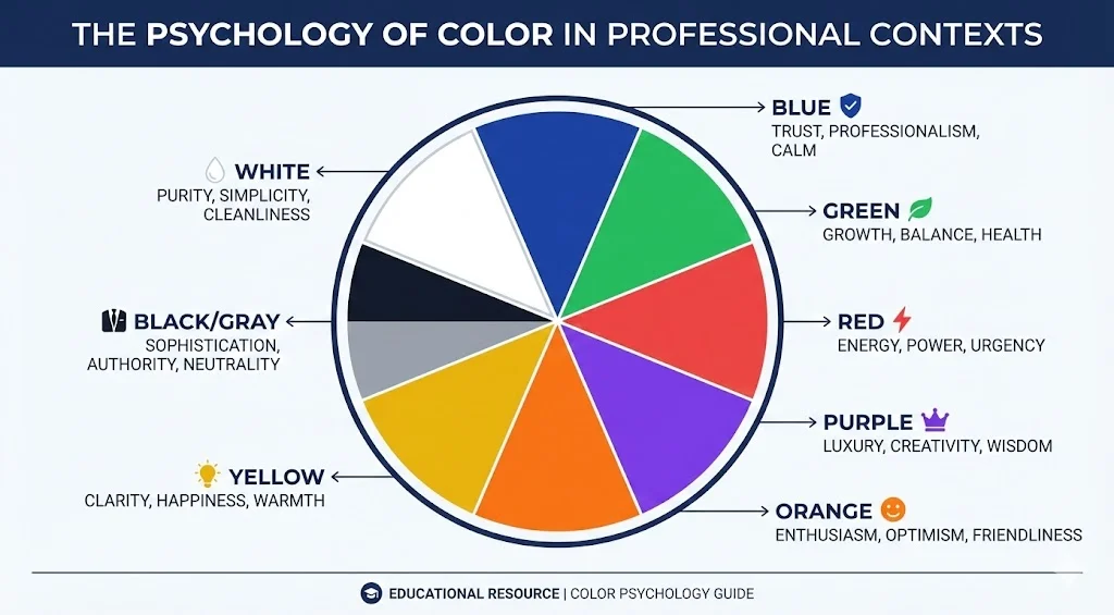
The Psychology of Color in Professional Settings
Different colors evoke different emotional responses and associations. Here's what research tells us about color psychology in professional contexts:
Associations: Trust, professionalism, stability, intelligence, competence
Best for: Corporate roles, finance, healthcare, technology, consulting. Blue is the most universally accepted professional color and works across virtually all industries.
Caution: Can feel cold or impersonal if too dark or dominant. Balance with warmer accents.
Associations: Growth, balance, health, sustainability, freshness
Best for: Environmental sectors, healthcare, wellness, finance (money), education, nonprofits focused on growth or sustainability.
Caution: Darker greens convey wealth and prestige; bright greens can appear too casual for conservative industries.
Associations: Energy, passion, urgency, power, excitement
Best for: Sales, marketing, entertainment, food industry, emergency services, activists and advocates.
Caution: Can be aggressive or overwhelming. Use strategically as an accent rather than dominant color in conservative fields.
Associations: Creativity, wisdom, luxury, sophistication, innovation
Best for: Creative industries, luxury brands, education, spiritual/wellness sectors, innovation-focused roles.
Caution: Can appear unconventional or eccentric in traditional corporate settings.
Associations: Enthusiasm, creativity, friendliness, confidence, vitality
Best for: Creative fields, startups, youth-oriented brands, fitness, hospitality.
Caution: Too bright can appear unprofessional in conservative industries. Use muted tones for broader appeal.
Associations: Optimism, clarity, energy, innovation, warmth
Best for: Creative industries, education, children's services, innovation sectors.
Caution: Can be difficult to read against light backgrounds. Use as an accent rather than primary color. Avoid in conservative corporate settings.
Associations: Sophistication, authority, elegance, seriousness, timelessness
Best for: Luxury brands, law, architecture, fashion, photography, executive roles.
Caution: Can appear too formal, cold, or heavy. Balance with lighter or warmer accent colors.
Associations: Cleanliness, simplicity, modernity, clarity, freshness
Best for: Healthcare, technology, minimalist brands, modern design, wellness.
Caution: Can lack visual impact. Works best combined with strategic color accents.
Industry-Appropriate Color Choices
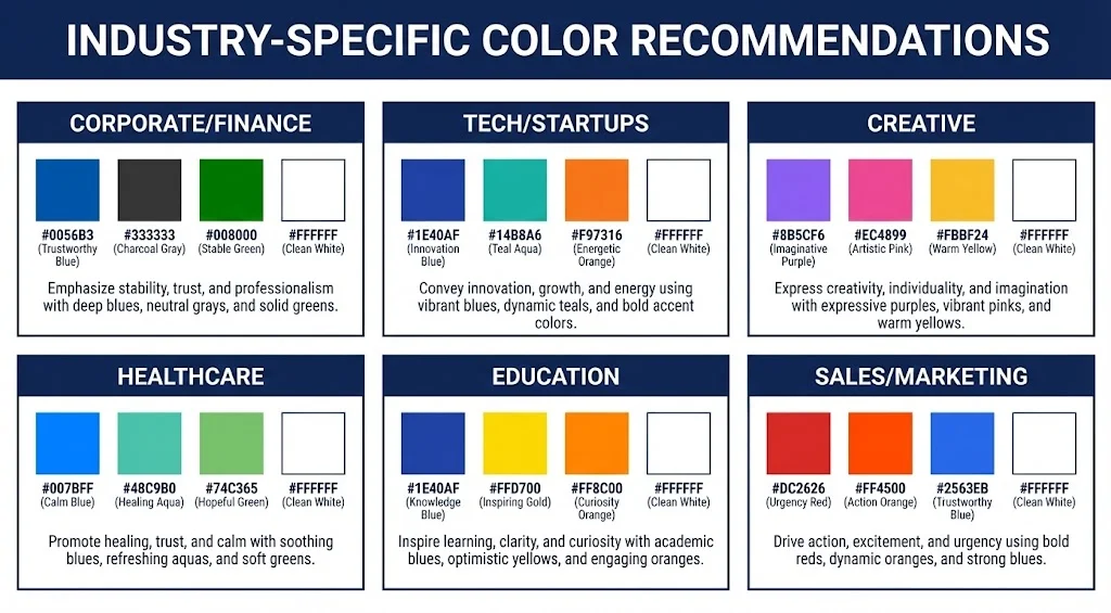
Different industries have established color norms. While you can (and sometimes should) deviate from these norms to stand out, understanding them helps you make informed decisions:
Navy blue, charcoal gray, forest green, burgundy. These convey trustworthiness, stability, and professionalism. Avoid bright, loud colors.
Blue, teal, purple, modern grays. Tech embraces innovation, so contemporary color choices work well. Clean, modern palettes that suggest cutting-edge thinking.
Virtually any color works, including bold, unconventional choices. Your color selection can itself demonstrate creativity and personality. Consider trending colors or unique combinations.
Blue (trust and calm), green (health and healing), white (cleanliness). Avoid aggressive colors like red that might increase anxiety.
Blue (knowledge), green (growth), yellow/orange (energy and optimism). Warm, inviting colors that suggest learning and development.
Energetic colors like red, orange, and bold blues. Colors that grab attention and convey confidence and results.
Aligning Frame Colors with Your Personal or Company Brand
If you already have an established personal brand or represent a company with brand guidelines, your frame colors should align:
- Company Brand Colors: If you're actively representing your employer, consider using your company's brand colors in your frame. This shows company pride and creates visual consistency with your company profile.
- Personal Brand Colors: If you have established personal brand colors (common for consultants, coaches, and entrepreneurs), use these consistently across your profile picture frame, banner, and any visual content you create.
- Complementary Approach: If your company's brand colors don't suit profile frames (too bright, too dark, or clash with diverse photo backgrounds), choose complementary colors that harmonize with the brand while working better in a frame context.
Color Accessibility Considerations
Approximately 8% of men and 0.5% of women have some form of color blindness. Additionally, low contrast can make frames difficult to see or read. Consider these accessibility principles:
If your frame includes text, ensure sufficient contrast between text and background. WCAG guidelines recommend a contrast ratio of at least 4.5:1 for normal text.
Red-green combinations are particularly problematic for color-blind individuals. Similarly, blue-yellow combinations can be difficult for those with certain types of color blindness.
Use color blindness simulation tools (many available free online) to see how your frame appears to people with different types of color vision deficiency.
If your frame conveys information (like certification status or role), don't rely on color alone. Include text or icons that communicate the same information.
Creating Effective Color Combinations
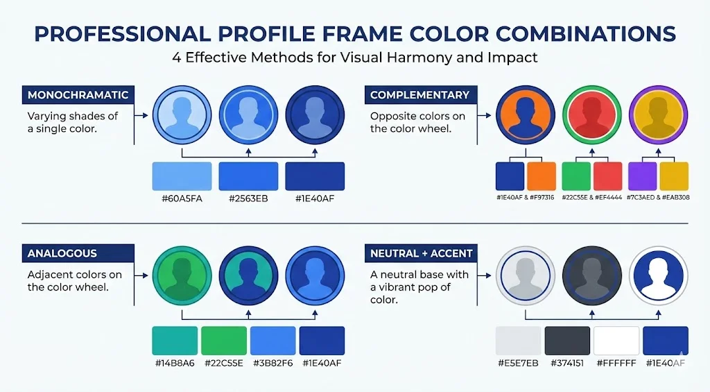
Most effective profile frames use 2-3 colors maximum. Here are proven approaches to combining colors:
- Monochromatic: Use different shades of the same color (e.g., light blue, medium blue, navy). This creates a cohesive, professional look that's easy on the eyes.
- Complementary: Use colors opposite each other on the color wheel (e.g., blue and orange, purple and yellow). This creates visual interest and energy but should be used carefully.
- Analogous: Use colors next to each other on the color wheel (e.g., blue, teal, green). This creates harmony and is generally easy to look at.
- Neutral Plus Accent: Use a neutral color (gray, black, white) as the primary color with a bold accent color for highlights or text. This is safe, professional, and versatile.
Frame-Generator.com provides a color picker tool that makes it easy to test different color combinations and see them in real-time on your profile picture before committing to a choice.
Matching Frame Colors to Your Photo
Your frame colors should enhance, not clash with, your actual profile photo:
- Consider Your Background: If your photo has a colored background, choose frame colors that complement rather than compete with it.
- Match Your Clothing: You can create a cohesive look by echoing colors from your outfit in the frame, but avoid exact matches which can appear too matchy-matchy.
- Skin Tone Considerations: Certain colors are more flattering with different skin tones. Blues and greens tend to be universally flattering, while some yellows and oranges can clash.
- Neutral Photos Work with Everything: If you have a neutral background (white, gray, etc.) and wear neutral colors, you have maximum flexibility with frame colors.
Color Trends vs. Timeless Choices
Consider whether you want your frame to be trendy or timeless:
Colors like millennial pink, Gen Z yellow, or whatever's currently popular in design can make you appear current and in-touch. However, they may look dated in a year or two. Best for roles where being trend-aware is valued (marketing, design, fashion).
Classic navy, charcoal, hunter green, burgundy never go out of style. They'll look appropriate in 5 years as they do today. Best for roles where stability and reliability are valued.
Common Color Mistakes to Avoid
- Too Many Colors: Using more than 3 colors creates visual chaos and looks unprofessional.
- Neon or Oversaturated Colors: While they grab attention, they can be jarring and difficult to look at, especially on screens.
- Poor Contrast: Text that's hard to read defeats the purpose of including text in your frame.
- Clashing with Your Photo: Frame colors that compete with your photo create visual discord rather than harmony.
- Ignoring Industry Norms: While standing out can be good, being so different that you appear unprofessional can hurt your credibility.
Testing and Refining Your Color Choices
Before finalizing your frame colors:
- View your profile picture at different sizes (full size, thumbnail, mobile)
- Check how it looks on different devices and screens
- Ask trusted colleagues for feedback
- View your profile in the context of LinkedIn feed and search results
- Consider whether the colors still work in grayscale (for printing or accessibility)
Final Thoughts
Color choices for your profile frame might seem like a minor detail, but they're a powerful tool for communicating your professional identity and making your profile memorable. The right colors reinforce your industry credibility, align with your personal brand, and help you stand out for the right reasons. Take time to consider the psychological impact, industry norms, accessibility, and how colors interact with your actual photo. The result will be a polished, professional frame that enhances rather than distracts from your LinkedIn presence.
Ready to Apply These Principles? Use our free frame generator to experiment with different color combinations and see them applied to your photo in real-time. Or browse our preset gallery for professionally designed color schemes.
Latest Articles

Frame Your Face with a Custom Banner 🖼️

Spice Up Your LinkedIn Profile with Emojis 💥

Stand Out with 𝑪𝒖𝒔𝒕𝒐𝒎 𝑭𝒐𝒏𝒕𝒔 on LinkedIn 🖋️

LinkedIn Profile Photo Best Practices for 2026

Personal Branding on LinkedIn: A Complete Guide
Profile Picture Dimensions Guide for All Social Platforms
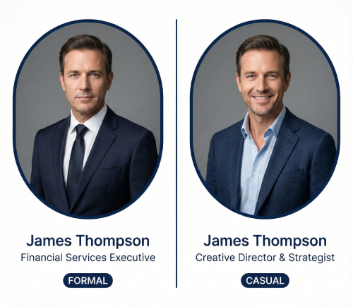
Professional vs. Casual Profile Pictures: Which is Right for You?
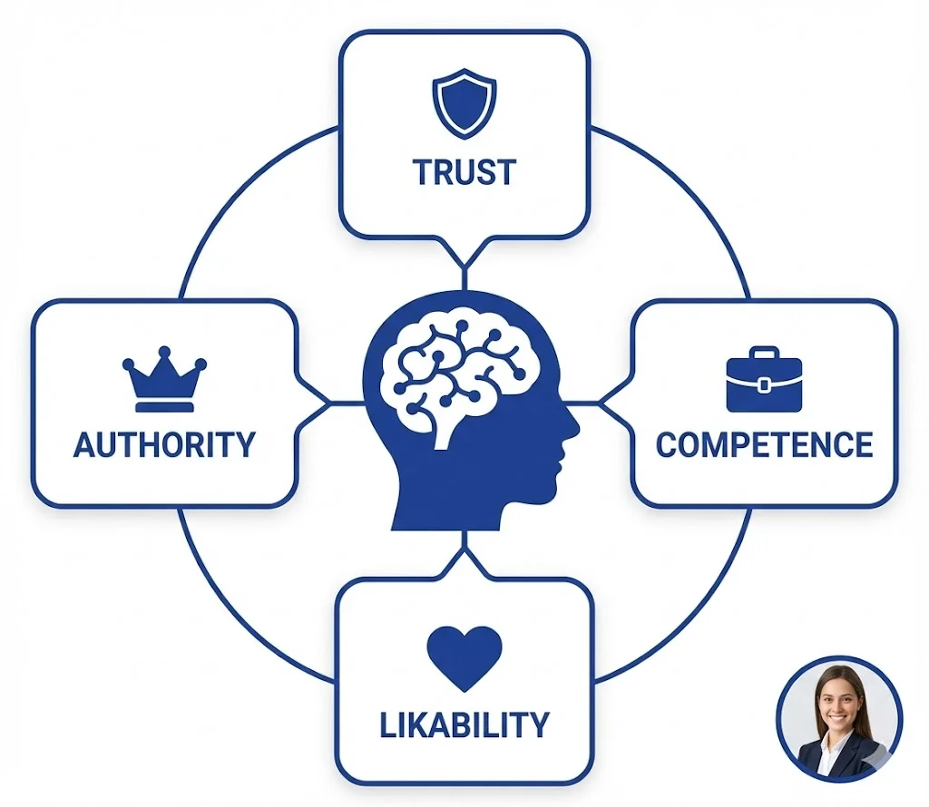
The Psychology of Profile Pictures in Professional Networking
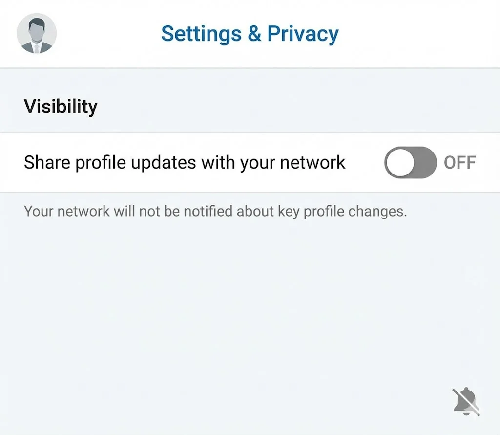
How to Update Your LinkedIn Profile Picture Without Notifying Everyone

Step-by-Step Tutorial: Creating Your First Custom LinkedIn Frame
15 Common LinkedIn Profile Mistakes (And How to Fix Them)